Hello Everyone,
I apologize for being absent. Seniors! You are down to 3 days to complete your movie posters. Some helpful hints for the best grades:
--Check your fonts. MANY people are not finding fonts that are actually close to the originals.
--Check your LEVELS. We get so caught up in special effects, fonts, and models that we forget to check the basics like levels.
--Is your lighting correct? Check where the light is hitting the model in the poster, and then check yours. Do they match?
--Ask your neighbor for help! Don't be shy. There are multiple ways to do anything in photoshop. Your neighbor might have a tip or trick to help you figure something out.
If you have a legit emergency question, you can usually leave a comment here and I can respond to you pretty quickly.
I will create turn-in folders tomorrow :)
I would prefer if you do not use cameras today. If it is an emergency necessary for your final, you can use cameras on an as-needed basis and please let the sub know where you are going and for how long.
Monday, May 15, 2017
Wednesday, May 10, 2017
- Think of
a THS school activity/theme
that you would like to create a poster for. Examples Sports, Clubs, THS Classes, or
make up your own THS activity.
- -POSTER IDEA= You will find design ideas
for poster on http://www.movieposter.com/.
The posters on these websites are professionally designed. Take their professional poster ideas and
your theme to create a poster, use the professional poster to borrow ideas
for composition placement of objects, text font, color, and techniques. Remember your poster should look very
close to the professional movie poster you found on the internet with the
exception of the photographs which should your own photos.
- -Pick a poster design that is challenging and not too
easy. If you select a poster design that is
too easy you will not receive full credit for this project. You need to start on a blank Photoshop
document and create your own poster. You borrow ideas from the professional
poster to create your own poster
- -IMAGE SIZE= In Photoshop, you can
choose from these poster sizes 8X12, 11X14, or 12X18 and set the document
@ 300 resolution.
Friday, May 5, 2017
1. Today you will open that WORD document you answered Haring questions in.
2. Insert your finished Haring work in the document.
3. Tell me under your work: What is the message or meaning behind your piece? What is happening there?
4. Drop your WORD document with your finished image inserted, into the turn-in folder.
2. Insert your finished Haring work in the document.
3. Tell me under your work: What is the message or meaning behind your piece? What is happening there?
4. Drop your WORD document with your finished image inserted, into the turn-in folder.
Thursday, May 4, 2017
Check your Haring!
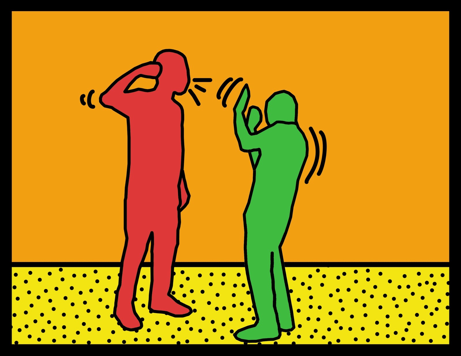
Your finished product should have the basic components of a Keith Haring drawing. This includes:
--Smooth black outlines
--Bright colors
--Patterns
--Can you tell what your people are doing? Is there meaning?
Forgot how to outline?
0. Create a new blank layer
1. Set your color to default black
2. Set your BRUSH tool to the size you want your outline, with 100% hardness and 100% flow/opacity
3. Using PEN TOOL, do a dot to dot outline of your person
4. Right click and select "Stroke path"
5. Select "Brush" from the drop down and click OK
6. Hit "escape" on your keyboard to get rid of the old path
--Smooth black outlines
--Bright colors
--Patterns
--Can you tell what your people are doing? Is there meaning?


Forgot how to outline?
0. Create a new blank layer
1. Set your color to default black
2. Set your BRUSH tool to the size you want your outline, with 100% hardness and 100% flow/opacity
3. Using PEN TOOL, do a dot to dot outline of your person
4. Right click and select "Stroke path"
5. Select "Brush" from the drop down and click OK
6. Hit "escape" on your keyboard to get rid of the old path
Monday, May 1, 2017
Keith Haring

Do a Google
Image search of KEITH HARING to take a look at the man and his work.
Then do a regular
Google search to answer these simple questions in a new WORD document:
1. What years was Keith Haring alive, and where did he live?
2. How would you describe his pictures (Hint: what are the
elements of art he seems to use most?)
3. Keith Haring was known for putting his drawings over
advertisements in the subway, and using his art to create awareness. What cause
was he creating awareness for?
4. Haring died young, from what disease?
5. What are your thoughts on his style, and WHY?
In this
project, you will make your own Keith Haring design derived from a photograph. Take several photos involving at least 2
or more people. They need to be doing some sort of action or communicating some
kind of emotion which involves body language, since Keith Haring’s people do
not have faces to convey emotion. Brainstorm and shoot at least 3 different
scenes, as this will give you back up options if one photo does not work out
well.
THINK/PLAN:
What lines do you need to add to suggest actions like moving or talking?
THINK/PLAN:
What Haring-style patterns can you fill areas with to add visual interest
without becoming too “busy”?
THINK/PLAN:
Haring was an activist. He made pictures which commented on human emotion and
actions. What emotions or actions will your picture convey? What are you saying
about the human condition?
In Progress:

Finished:

Another student example: 
Friday, April 28, 2017
** Complete the "Reflection" portion of your planning worksheet from Tuesday. This is where you will tell me *How your project came out, in your opinion. *What you thought was successful about it. *What you wish you could have changed or made better IF you had access to any prop/location. *What grade do you think your finished product deserves?
** Turn your finished file into the M:/ Folder. Put your paper in the turn-in box on the counter.
**Finished early? Make one of these easy frame/mirror illusions:


** Turn your finished file into the M:/ Folder. Put your paper in the turn-in box on the counter.
**Finished early? Make one of these easy frame/mirror illusions:


It is easier than you think!
1. TAKE A TRIPOD and set it up at your location
2. Take a shot of your model at the desired location, holding their frame
3. DO NOT MOVE the camera. Take the same shot WITHOUT the model
4. Load the two photos into Photoshop.
5. Drag the shot with the model on top of the blank shot.
6. Layer mask or erase the middle of your frame- It will show the background from the bottom photo.
Tuesday, April 25, 2017


Monday, April 24, 2017
Catch up- look ahead
Hi everyone! Welcome back.
Today we will be doing 3 things.
1. Pick up any prints of your work on the counter.
2.. Check your progress report grade and make sure everything looks correct.
3. Turn in your double exposure photos (2!!!) See last post.
These are coming out WONDERFUL. The best ones align the nature photo with the natural lines of the model's face/anatomy. Take a look:The branches in the first radiate out from the face, mimicking hair, and the bark almost fits like a coat.


4. Begin formulating ideas for the next project- "Two sides to every story"
You are going to come up with a concept for this project that will require some creative thinking. It can reflect an experience in your own life, or you can make one up. You are going to present two sides to a story, using your photography skills, editing skills, and your fellow classmates as models/actors. You will be the art director, producer, photographer, and editor- meaning you are not in your own shots- you are calling the shots.


Today we will be doing 3 things.
1. Pick up any prints of your work on the counter.
2.. Check your progress report grade and make sure everything looks correct.
3. Turn in your double exposure photos (2!!!) See last post.
These are coming out WONDERFUL. The best ones align the nature photo with the natural lines of the model's face/anatomy. Take a look:The branches in the first radiate out from the face, mimicking hair, and the bark almost fits like a coat.

Here, he lets the face divide the space between the green leaves and tiny flowers, so the flowers fit almost like a veil.

4. Begin formulating ideas for the next project- "Two sides to every story"
You are going to come up with a concept for this project that will require some creative thinking. It can reflect an experience in your own life, or you can make one up. You are going to present two sides to a story, using your photography skills, editing skills, and your fellow classmates as models/actors. You will be the art director, producer, photographer, and editor- meaning you are not in your own shots- you are calling the shots.


You will take several base shots like these 3, presenting your frames, which will be your story boards, in various ways. Decide if you want your frame-holders faces showing, or not. Inside the frames, you will present two photographs that tell two sides to a story.

Tuesday, April 11, 2017
Pick your TOP 2 portraits. You are going to prep them for the tutorial.
Find full tutorial HERE

1. fix large blemishes
2. crop excess space
3. Add brightness/contrast
4. quick select the background and CTRL+SHIFT+I to invert your selection (so the person is selected)\
5. Click "refine edge" in your toolbar
6. Increase the "radius" slider until you have grabbed any stray hairs or details. Play with your other sliders so make your selection perfect.
7. In the "output" section of that menu, click "New layer with layer mask". Click ok.
8. This should have made what we call a "clipping mask" or a new layer mask clipped to your selection
9. Create a new layer. Place it underneath your portrait.
10. Use paint bucket to fill your new layer with a neutral gray. Do this by double clicking your main color swatch until you get the color picker menu. See where it has a # sign on the bottom. Enter this #dcdbd9
11. Choose your second photo of a natural scene or texture
12. Put that image above your portrait
13. Hold control and click the LAYER MASK of the portrait (not the actual picture). That should make a selection in the shape of the man.
14. Click the "add layer mask" button (down there by Fx button. Looks like a square with a circle in it)
15. If you click the tiny chain link between the image thumbnail and mask, it will allow you to move the nature layer around for the best fit. You could also flip or rotate the nature layer to fit well with your portrait.\
16. CTRL J your portrait layer to make a second one.
17. Place it above the nature layer, so you should have a portrait layer, a nature layer, and another portrait layer.
18. For an interesting effect, desaturate the portrait and nature layers and "colorize" them using the hue & saturation menu
19. Open levels. Make the top portrait much darker.
20. Right-click on the portrait layer mask and we can Apply Layer Mask in the dropdown menu. Change the Blending Mode of the portrait layer to Screen in the Layers panel.
21. Now it is a matter of blending the two images together. If you select the MASK on the nature layer (the black and white attachment) you can use a soft, low opacity brush to blend the two. Wherever you paint BLACK, the person will show. When you paint WHITE, the nature will show.
Monday, April 10, 2017
Double Exposure
Check out some of these portraits: http://reelfoto.blogspot.mx/2011/06/platon-power-of-portrait.html Ask yourself- is your portrait powerful?
Do basic edits on your portraits. That means ***Levels ***Cropping ***basic spot healing for acne/etc. ***Run your 20 portraits into a 4 Column 5 Row contact sheet and submit to the turn-in folder.
https://design.tutsplus.com/tutorials/make-a-trendy-double-exposure-effect-in-adobe-photoshop--cms-23774
I am hesitant to do a whole class demo since we have testing again this week. I did have really good results when I gave Photo II the link to this tutorial and had them work independently, so we are going to try that method this week and see how it goes. You will need
Thursday, April 6, 2017
Double exposure
We will be taking a series of portraits and a series of textures and landscapes to combine into a single double-exposure image. The term "double exposure" refers to the old days of film, where a photo would sometimes contain 2 exposures.


Tuesday, April 4, 2017
Check yourself!
So far for 4th Quarter, you should have...
1. Pen tool sports collage with at least 5 figures (30)
2. Jake Waldo (10 pts)
3. Retouching folder with (10 pts each)
-Nose job guy
-Your own face
-2 girls
-Nose job girl
4. Illusion contact sheet and best photo (30)
1. Pen tool sports collage with at least 5 figures (30)
2. Jake Waldo (10 pts)
3. Retouching folder with (10 pts each)
-Nose job guy
-Your own face
-2 girls
-Nose job girl
4. Illusion contact sheet and best photo (30)
Monday, April 3, 2017
Awesome, gravity defying illusions are underway.
By the end of today: You will have at least 10 shots of experimenting
Tomorrow: You EDIT your best 4
You will turn in: a contact sheet of the best 4 and 1 BEST PHOTO
What makes an illusion good?
-Good lighting (model is NOT super dark as a result of backlighting)
-Creative pose
-Pose done properly (so the illusion looks real)
-Cropping any excessive space
-Doing your levels to boost contrast and color
Check out some of my favorites from past years:


Tuesday, March 28, 2017
Make Fun of Jake Day
Once a year, we have a different challenge to do something with my boyfriend's face. Then all of his students get to see it and enjoy the best of your Photoshop pieces. This year, we are trying to hide Jake's face for a Where's Waldo challenge- his students will actually have to find his face in a crowd or famous image. It will take your clever Photoshop skills to make it clever and difficult.
Tricks:
-Search source files on LARGE for high quality
-Use Image-->Adjustments--> brightness/contrast or levels to make the values of the source image match the face
-CTRL + J objects in the foreground to overlap the face and hide it if necessary
-Don't underestimate black and white. It can be challenging!
Source images and examples:


Monday, March 27, 2017
Hello everyone, I apologize for the absence.
I would like you to not only finish ALL of the retouching challenges we tried, but also create a new challenge by trying a tanned skin tone on your models. You can find the step by step instructions on the M drive, at the end of the retouching document provided. So far, you have only submitted a portion of your facial retouching abilities to me. By tomorrow I would like you to have at least 2 models you have tried this technique on, among others. if you finish early, you can do work from another class or do extra photos for extra credit.
Friday, March 24, 2017


Thursday, March 16, 2017
Pen Tool sports collage
I'm finally back, so I can show you some examples from past years!


 <-------- Careful not to have cut off chunks of mystery meat "floating". If your figure cuts off at the waist, you need to have them on the edge of the picture.


Sunday, March 12, 2017
Pen tool sports collage
You will be creating an homage to an athlete from your favorite sport using pen tool. We have used pen tool before, but many people are reluctant to use this powerful tool because it takes a little extra time. Unfortunately, pen tool usually gives you the best results when cutting an object, giving you complete control and smooth edges.
You have 3 days to do this, so take your time and make it look good.
1. Think about your favorite sport. If you're not into sports, pick a sport you find visually appealing. It can be anything! I have had people use tennis, ballet, running, martial arts, etc.
2. In photoshop, click File-->New and create a document that is 10" wide by 8" tall, 300 resolution.
3. Using Google image search, click TOOLS and modify the SIZE filter to LARGE.
This will give you the highest quality images.
4. Find high quality images of your selected athlete. Copy and paste the photo into your new document in Photoshop.
5. Click on the pen tool. Zoom in on your athlete so you can see the details very clearly. I tell you to zoom in so you can do a precise job with the pen tool.

6. Click to connect a path of dots around the outside of your athlete.
7. Once you have completed your path, right click and click "make selection". This tutorial says you can also click CTRL+ENTER to get your marching ants.
8. Once you have ants around the outside of your athlete, you can click CTRL+J to copy a fresh, trimmed up version of your athlete into a new layer.
9. Discard the old athlete layer once you have your trimmed one.
10. Repeat this process until you have your athlete 5-7 different ways. Arrange them nicely so they overlap and make a nice composition. The athletes should have perfect, smooth edges. If you try to short cut using quick select, I will know.
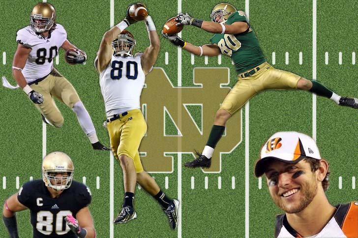
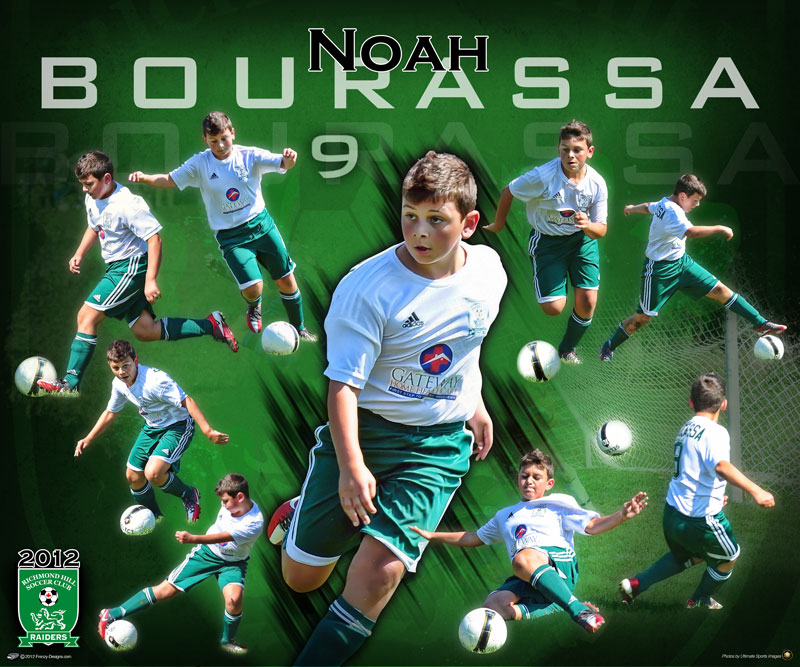
 This example is a different size/shape than yours, but the figures are still arranged nicely, so you get the idea. (I do not have access to my past examples to show you the proper ones!)
Here are some posters with a concept similar to yours

You have 3 days to do this, so take your time and make it look good.
1. Think about your favorite sport. If you're not into sports, pick a sport you find visually appealing. It can be anything! I have had people use tennis, ballet, running, martial arts, etc.
2. In photoshop, click File-->New and create a document that is 10" wide by 8" tall, 300 resolution.
3. Using Google image search, click TOOLS and modify the SIZE filter to LARGE.
This will give you the highest quality images.
4. Find high quality images of your selected athlete. Copy and paste the photo into your new document in Photoshop.
5. Click on the pen tool. Zoom in on your athlete so you can see the details very clearly. I tell you to zoom in so you can do a precise job with the pen tool.
6. Click to connect a path of dots around the outside of your athlete.
7. Once you have completed your path, right click and click "make selection". This tutorial says you can also click CTRL+ENTER to get your marching ants.
8. Once you have ants around the outside of your athlete, you can click CTRL+J to copy a fresh, trimmed up version of your athlete into a new layer.
9. Discard the old athlete layer once you have your trimmed one.
10. Repeat this process until you have your athlete 5-7 different ways. Arrange them nicely so they overlap and make a nice composition. The athletes should have perfect, smooth edges. If you try to short cut using quick select, I will know.

Here are some posters with a concept similar to yours
11. Finally, create an interesting background- whether you choose to use text like the Chicago bulls example above, or a custom gradient of your team's colors using this tutorial. Scroll down to where it says "The presets area" to begin.
If it works with your background, you can add drop shadows to your figures.
I WILL MAKE TURN IN FOLDERS ON THURSDAY when I return. Plan on having this finished by then.
If you finish early, here are a couple links to some interesting tutorials to try:
Friday, March 10, 2017
MACRO DUE!

Edgar Amador

Ashlee Jurevich

Bailey Vandergriff
Here are a sample of some beautiful flower macros I have seen in the classroom. Well done- to everyone- everyone has some shots that REALLY stand out, and I cannot wait to show these at the Turlock Public library in MAY!
MACRO CONTACT SHEET (30 pts) AND BEST PHOTO (10 pts) DUE TODAY. What I upload off the servers today is IT. I will be out of town, far far away from the school servers, and will not have access to your files. Also, ALL EXTRA CREDIT FOR Q3 IS DUE TODAY. Again, if it's not in the folder by 3pm, I will not upload it to my Google drive, and I will not see it.
Contact sheets are 3 COLUMNS and 5 ROWS. Make sure the rest of the boxes stay default- 8x10 300 resolution. The contact sheet should look like this (Thanks, Adelo!):

Monday, March 6, 2017

In this case, the photographer has an alleyway full of weeds, and he makes it work. I want you to experiment with angles in your macro shots, and if you have to include the background, make sure it is pleasing. We don't want to see things like fire hydrants, bathrooms, trash cans, cars, etc.
Take at least 3 different angles of each photo. Then you will have more options when you return to the classroom!
Here are the lists for those people catching up at home:
Subscribe to:
Posts (Atom)